The Loop

Matthew Gentzkow and Jesse Shapiro of the Bureau of Economic Research published a working paper a few years back on political media bias in American print newspapers. It was the kind of study that told you something you already knew but couldn’t prove before the dawn of the digital age. Continue reading

Advertisement

American Employment, 2016

The United States of America has reached full employment-that sought after term used by economists that describes an unemployment rate where all who are able and willing to work, are working.  Though the actual number that represents full employment varies based on who you ask, it’s around 5.5% or less.  That’s where we are.

This month, Americans attained a massive achievement.  In a long fought journey back from the depths of recession, we’ve traveled from 10% unemployment, a rate not measurably exceeded since the Great Depression, to full employment.  Every single day of reduction of unemployment since the Great Recession of 2008-9 has taken place under the Obama administration.  During this same time, our federal deficit spending, as a % of GDP has shrunk to its lowest point since 2005-lower than all but one year in the Reagan and first Bush administrations combined, lower than the first term of the Clinton Administration.  These are facts supported by raw data that has been collected by consistent, non-partisan means for decades.  These numbers of economic strength are hard to argue with, on a macro-economic scale.  But for some reason, most Americans don’t feel that good about the direction of the country-in economic perspectives. Even our most fervent optimists admit, it doesn’t really feel like full employment. But why?  You could dismiss the sentiment as a result of partisan bickering in an election year-one covered on an unprecedented scale by the largest media market in the history of mankind, accelerated by our current social media environment.  You could do that.  Or, you could take a deeper look at the data.  We did the latter.

That Data

There’s no shortage of data to be found on topics that people care about these days.  But you have to be careful with who is supplying it to you.  Political organizations, even those that don’t sound political but actually are-think tanks, policy centers etc., tend to start with a point and then find the data to confirm it.  If you’re serious about data though, and you are interested in understanding instead of confirming, you start with the data.  The confirmation comes later.

The Bureau of Labor Statistics is a virtual treasure trove of data.  And if you take a look at two massive surveys they collect, the Occupational Employment Statistics Survey (OES), and the Current Population Survey (CPS), you can see the detail on job categorization, population, pay and employment status in raw form.  That’s exactly what we did.  What we found was a very clear and compelling.

Unemployment

You’ve heard President Obama himself tout the massive reduction in unemployment on his watch.  If you’ve paid attention to the Republican presidential primary race, you’ve also heard the counter-point that the impressive number is a “fake” number.  And that behind it, hides significant problems with people who have quit looking for work or people under employed.  So which one is it?  The good news is, the CPS, which is a monthly survey consistently delivered since 1994 and scientifically managed to be statistically significant, actually tracks that stuff.  What does it say?  Well, it says that the President is right.  We have reduced unemployment significantly across all groups, to include marginally attached workers (those who want work and stopped looking) and part time workers.

It’s not 5.5% like the pure unemployment number, but it’s pretty much back within normal range of our pre-recession levels.  Unfortunately for the opposition, but fortunately for the country, people are finding jobs-full time jobs-again.  And the trend is continuing to improve every month.

Job Category

So if we’re getting jobs, clearly they’re not good ones any more.  That’s why people are upset.  Right?   That’s the voice of discontent from the middle class these days.  So we looked in the Occupational Employment Survey to see how things have changed, since the current form of survey started in 1997.  Terminology regularly changes here, so we had to do quite a bit of work to broaden it to get to an apples to apples comparison, but here’s what we found.
Screen Shot 2016-02-19 at 8.33.18 AMOur conclusion is that there has been a little shifting around.  But not much.  For the most part, over the last 20 years, Americans are consistently working in the same types of jobs.  There’s some uptick in management and computers,  some shrinkage in agriculture and science, but it’s mostly the same.  So what’s going on?  Well, when you start to look at income, the picture gets clearer.

Income

When you peal back the overall employment status, number and job type, you can see the income patterns.   At the highest level, the American worker is actually out-legging inflation over the last two decades.

Screen Shot 2016-02-19 at 8.33.43 AM

The graphic above shows that, as a whole, the American worker makes $626 more a year then they did in 1997 adjusted for inflation.  That’s a good thing.  So, unemployment is stable, we’re continuing the same types of work we used to do at a macro level, and we’re making more money then we used to.  What’s the problem?   It’s this.  The “we” in that statement above, is fantastically uneven when you move one click down on the income detail.

Screen Shot 2016-02-19 at 8.34.32 AM

If you are one of the higher paid job categories, things have been pretty rosy for you the last few decades.  White collar and professional jobs have seen their income increase relative to inflation since 1997 significantly.  When you look at the management bucket, the second highest paid group behind the much smaller legal industry, you see a massive 20% increase in income for people already making more money then just about everyone else.  Hold that thought.  Because it will start to help you understand some of the frustration being felt by the other group of American workers shown in the next graphic.

Screen Shot 2016-02-19 at 8.34.11 AM

Educators, blue collar workers and service providers are hurting.  If you look at manufacturing, construction and maintenance workers, you’ll see that group has seen a 10% pay cut since 1997, despite being the most productive manufacturing workforce in the world, per capita.   That group is the largest portion of the American workforce.  Roughly one-in-four Americans works there.  Our next biggest group, Administrative workers, is down 4%.  So when you start to look at that pie chart through the lens of income, the picture actually gets pretty bleak.

Screen Shot 2016-02-19 at 8.33.30 AM

There are a lot of Americans, most actually, that are in a worse condition now, then they were 20 years ago, from an employment perspective.  Which means there’s a lot of Americans who are justifiably dissatisfied. And the current political environment is quickly taking that appropriate dissatisfaction and throwing gas on it-urging us ever closer to a once inconceivable outcome of a Trump/Sanders presidential race.

People are angry.  And I think we’ve done a fair job at showing why they’re pissed.   But where should we aim that anger?  Which side has it right?  Is it Trump angry?  Is it Bernie angry?  Let’s start with some facts.

Some Facts brought to you by the good folks at Forbes Magazine, the Huffington Post and the United Nations.

  • In 2001, China joined the World Trade Organization.
  • The average annual salary for a manufacturing employee in China is $7,705.
  • The average annual salary for a manufacturing employee in the U.S. is $37,440.
  • 22% of the world’s manufacturing is done in China, more than any other country in the world.
  • 17% of the world’s manufacturing is done in America, more than any other country in the world except China.
  • In 1992, the United States manufactured more goods than any country in the world. China was 6th.
  • Companies in the S&P 500 reported over 30% profit growth in 2012.
  • During that same time, employment in those companies shrank by 1M jobs.
  • Over the last decade, corporations in America have increased employment in countries other than America 30%.
  • According to Moore’s Law, computer processing capacity doubles every year.

There’s a lot that goes into why the economic outlook has changed over the last two decades.  You’ll find most of your major culprits somewhere in that list though.  And though you could throw the catch all, “because that (insert political figurehead) has ruined America, we’re so unfriendly to business, all the jobs are leaving”, I’ll add one more graphic that shows that the business and taxation environment in America has never been greater and that investment in the American workforce during that time has been non-existent.

Screen Shot 2015-06-08 at 11.28.25 AM

So what?

Unfortunately for some potential office seekers, economically speaking, you don’t see immigration, the degradation of conservative family values, government spending, Obamacare, welfare or even taxation in that list above.  You could try to add taxes in there if you want to. Our corporate tax rates (35% max) have been the same since 1994, and haven’t been lower since 1941. So you would be wrong. So why are the people that are most impacted by this shift so angry at those things?  It’s a really hard thing to explain.  But I’ll give it a shot.

Most of the things that have driven a negative shift in the quality of life for middle class Americans are events driven by innovation and free market capitalism.  So we’re stuck with a choice between being angry at something we don’t know how to be angry at and being ok with our lives being worse then they used to be.  We do neither willingly.  So, like an unhappily married couple, working class Americans have taken to blaming their outcomes on the things we really know how to get angry with.  Things like inequality, racial injustice, immigrants, people who are different, whoever is in charge.  Did I say people who are different?  Burn the witches because the crops have failed.  We’re humans.  This is what we do. And it’s not new.  So we’re doing it in spades.  We can’t get mad at free market capitalism and innovation, but we can get mad at something.

What do we do about it?

This is where you have to be careful. Using the impacts of free market capitalism to explain a negative economic outcome and claiming that free market capitalism is bad are not the same things.  Capitalism is good.  Right now, though, it’s not good for the American middle class.  It’s improving the middle class of developing countries at an unprecedented rate.  And that’s good.  Because it promotes global societal health and stability.  And though people are screaming about how dangerous the world is today, coming off a century of near global nuclear war, multiple world wars and the spread and then failure of communism, ISIS is a relative lightweight compared to the demons of our past. We’ve never been safer. But we’ve still got a problem. Our middle class is hurting.  And the data shows it’s real pain.  And it has nothing to do with whatever party is in office.

So what do we do about it?  Well, unfortunately for most of the working middle class folks who identify as conservative, you’re not going to like the answer.  The types of things that tend to solve the problems of employment income and de-insdustrialization tend to look like government intervention in the economy.  And that’s a little scary.  But I’d like to start a discussion on solutions and outcomes. This is what that sounds like.  Here are three things I would like to see help the middle class.

  1. Increase in public works projects that will overhaul our deteriorating infrastructure (see Flint, MI) and create high paying jobs for skilled laborers that can’t be outsourced.
  2. Decrease the burden of healthcare costs for all Americans.
  3. Incentivize private sector investment in the American workforce or levy higher taxes on their record profits. Doing neither is bad for America.

Now, I assume that many people will object to these proposals.  Especially the #3.  That’s scary stuff.  But we’re in uncharted ground and it’s not going to fix itself.  I even assume that the very people who this will actually help will also object to them in the name of principal.  But what I’d ask of those who do is to demand that your candidate provide an alternative solution to the very real problems of the American middle class.  And don’t settle for the nonsense designed to channel your focus and frustration at things like immigration, rich people, Muslims, gay people, cops or the poor.  They have nothing to do with it, no matter how much you want them to.  If we’re going to get better than we are,  we have to be better than that.  And we’ve got real problems to solve.

Archie’s Prophecy

In February of 2004, Eli Manning, the younger brother of NFL star quarterback Peyton Manning and son of All Pro New Orleans Saints Quarterback Archie Manning, was poised to be the number one pick in the NFL’s draft after a record breaking college career at his father’s Alma-mater, Ole Miss. The San Diego Chargers, coming off of a dismal season, their 10th losing season in the previous 11, had the first pick in the draft.

Eli was to be their savior, just like his brother was to the good people of Indianapolis.

There was one problem though.

His dad.

Archie had a very clear message for his son. The Manning’s were too good for San Diego football. He was right.

Looking back on the last 11 years of football in the NFL, it’s hard to point to a more prophetic piece of advice than Archie’s to his son.  Even beyond football, his guidance has proven to be one of the great “listen to your dad, son” moments in history.

Let’s review:

In 2004, the Chargers already had a quarterback, Drew Brees. They went ahead and drafted Eli anyway only to trade him to the Giants for their first pick that would ultimately land the Chargers their current quarterback Philip Rivers. Which means that during one calendar day, April 24th, 2004 the San Diego Chargers had Drew Brees, Eli Manning and Philip Rivers on their roster. Two of those three are on their way  to the hall of fame. The other presently plays for the Chargers.

It’s not Philip River’s fault though. And he may make it to the Hall. Besides Warren Moon, he’s thrown more touchdown passes than any other quarterback never to play in a Super Bowl. Which appears to be a very Charger thing to do. There are only five players in NFL history to throw over 250 touchdown passes and never play in a Super Bowl. Two of them, Rivers and hall of famer Dan Fouts, played for the Chargers. Which means that if your goal is to have your son be the best quarterback of his generation never to win anything, then the Chargers are your team.

Archie, who played 15 years in the NFL, made the Pro-Bowl and was widely regarded as one of the best quarterbacks of his era, never had a winning season. He knew the tune being played in San Diego well. And he didn’t like it.

Besides never really winning anything, as that’s not quite enough, there’s one other thing that is hard to put your finger on about San Diego and football that perhaps is even more damning. One that Archie probably sensed when evaluating his son’s opportunity. One that no one who loves football in San Diego is really willing to admit.

San Diego just doesn’t care that much about the Chargers.

Today the Chargers might be playing their last game as the San Diego Chargers. Because they are leaving. If not this year, soon.

For decades, the Chargers have been in a battle with the city of San Diego over the construction of a new stadium that deep down inside, most doubt was ever going to be built. Because it takes tax payer money.

On average, the 20 or so NFL stadiums built over the last 20 years have averaged about 65% public funding. Which means at a price tag of 1.5 Billion dollars, the city would have to come up with about a billion dollars.

Last year the city of San Diego paid their entire police and fire departments about $650M. Starting to see the problem?

You really need to care about football, more specifically about your team, in order to make that kind of investment. You need to care about football in a way that your football team is synonymous with your city. In a way that you feel like this type of investment and re-development will turn you city around. In a way where you believe that the existence of your football team is going to make your city more “livable” over the next 30 years.

If this is you, chances are, San Diego isn’t your town.  .

There’s an interesting thing that happens when you look at the demographic data of any given NFL city and the surrounding areas. If you take a look at how many people in a city are native to the area and expand that to the state as a whole, something interesting happens. It gets even more interesting when you factor in a team’s historic winning percentage, how long that city has had NFL football and the proximity of other established NFL teams. You can create what I like to call, a cultural significance index for any given NFL team. It’s not a fan support index as any team’s current performance is the indicator for that. It’s an index of how ingrained in the culture of the population of a given city a specific team is; how much they identify with the team.

Here’s what the data says:

Top 10 most culturally significant NFL teams for their current city:

  1. Green Bay Packers
  2. Pittsburgh Steelers
  3. Chicago Bears
  4. Cleveleand Browns
  5. Detroit Lions
  6. Philadelphia Eagles
  7. New England Patriots
  8. Minnesota Vikings
  9. New York Giants
  10. Buffalo Bills

Top 10 least least culturally significant NFL teams for their current city:

  1. Arizona Cardinals
  2. Tampa Bay Buccaneers
  3. Miami Dolphins
  4. Jacksonville Jaguars
  5. San Diego Chargers
  6. Seattle Seahawks
  7. New York Jets
  8. Houston Texans
  9. Oakland Raiders
  10. Atlanta Falcons

There’s some culturally insignificant teams that are filling the stands with lots of energy these days.

Seattle and Arizona come to mind.

Remember, this isn’t an index of how happy a city is with their team. It’s how much their city identifies with that team as part of their culture. If the Seattle Seahawks rattled off three or four losing seasons in a row, chances are the city would be significantly less energized. If the team left, life would go on.

If the Green Bay Packers or Pittsburgh Steeler’s left, people would wander around in the empty parking lot crying tears of despair for decades, largely unsure of their purpose as a community.

The Chargers are the 5th least culturally relevant team in the NFL. Of the four less significant then the Chargers to their respective area, only the Arizona Cardinals have had less winning seasons over the last 20 years. Of those five teams the Chargers play in the oldest stadium, 50 year old Qualcomm, ranked 30th out of 31 by Athlon Sports and Life Magazine’s stadium quality index.

So, you get it.

If the San Diego Chargers were a stock, you’d sell them. Because they’re in San Diego. And now they’re leaving. Because they should.

The billion dollars that San Diego tax payers would have to shell out to build a new stadium is something almost all San Diegans will realize no financial return on. Some local businesses may. Corporations may gain access to box suites. They might get a Super Bowl every 15 years. But your average San Diegan will get nothing, except the satisfaction of knowing their beloved Chargers are still here.

Here for the 29% of San Diegans over 25 who are actually from San Diego.

If San Diego is smart, they’ll never build it. They’ll move up the road to Los Angeles. Which by the way, doesn’t care about football either.  They haven’t had a team in 20 years. But they will have a stadium.  Because they’re big enough for two teams.

Look a little further down the list of culturally irrelevant teams and you’ll see the Raiders. They’re #9. And their stadium is #31. Get ready for 16 weeks of home games in Los Angeles. Because anything else doesn’t make any sense.

As for Eli, he’s got two Super Bowl rings, playing in a brand new stadium the the Giants and Jets self funded without any tax payer money for a team that is hugely culturally relevant in the largest market in the country. He’s played for the same head coach his whole career and he’s got a new contract worth $84 million.

The Manning’s won this debate. It’s not close.

Something about the “awe shucks”  delivery of Archie Manning makes me feel like he didn’t take the time to do the data dive that I’ve done to validate his guidance though. But like legendary tennis coach Vic Braden, highlighted in Malcolm Gladwell’s Blink, who can predict a fault on a serve over 85% of the time before the ball is even hit because he’s simply seen that many of them, Archie Manning  has seen enough bad football to know it when he sees it.

It’s likely the people of San Diego will see the last of theirs today.

The Good Old Days

Screen Shot 2015-12-05 at 5.44.36 PM
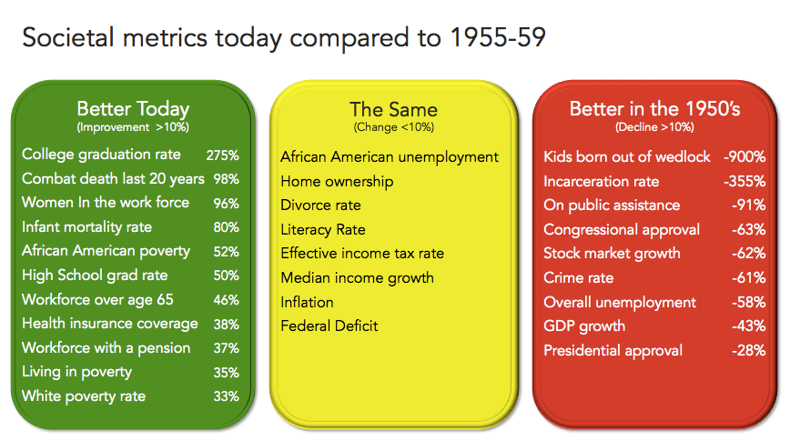
Table-1. Data compiled form the U.S. Department of Justice, Department of Labor, U.S. Census Bureau, The Pewe Research Center, The Brookings Institute and Gallup

You’ve heard it.  At some point someone you know has said it.  It may have been you.  But you’ve heard someone somewhere longing for the better times of the past.  A time in America where “traditional” values were embraced by all and we lived in a harmonious utopia, swimming in the perfectly temperate waters of civility that could only come from a simpler life.  A time when people treated each other better. Where we were safer and less exposed to the horrors that our modern world bestows upon us.  A time before the treacherous “next” generation had infected our stoic wisdom with dangerous thinking, loose morals, and a tragic lack of work ethic.  A time where America was great.  When today, she is something else. You know the tone.  It’s one part nostalgic and one part condescension.  It’s a sentiment that’s been around as long as our collective conscience as a species has spanned more than our own immediate horizon.  It’s what we do.  We long for the past.

For Americans, that time we long for is actually quite specific.  It still lives in the distant memories of our older two generations.  The “golden age” of America, the 1950’s, is that time that represents the zero, zero grid on the Cartesian graph that is America.  It was the post-war origin of our greatness.  The Garden of Eden before the apple.  But was it really that great?   Are we really that worse off today?

Taking a contextual look at the data can help.  So we did.  We took 28 societal metrics that were clearly measurable during the second half of the 1950’s and today and did a comparison.  Our findings, in Chart-1 above, were extremely interesting.  Of the 28 items, 11 were measurably better today than in the 1950’s. Eight were about the same, within 10% better or worse.  Nine were measurably worse.  Of the 28 metrics that can be directly compared, less than 1/3 of them were measurably better in the “golden age”.   The data alone isn’t enough to tell the story though.  But it certainly gives us a few places to start to look.   And it’s important that we do.  Because having an informed perspective about “what’s wrong with America” is a responsibility that requires more than whimsy and nostalgia.  It requires more than a bumper sticker or a snappy hat.  It requires fact in introspection.  Here’s what we found:

Family Life

Contrary to popular belief, marriages aren’t falling apart any faster now than they were 60 years ago.  The divorce rate is slightly lower today than back then.  Which is one of the more surprising metrics.  One thing that is happening is that less people are getting married.  Which has contributed in some part to what is the largest difference in all the data used in the comparison, children born out of wedlock.  In 2014, 42% of all children born in America were born to unmarried parents.  This is nine times the rate that they were in the 1950’s.  One of the more commonly politicized metrics is the present level of African American children born out of wedlock, which was 74% in 2013.  That’s a striking number.  There’s more to it than race though.  The issue is actually not being driven by any ethnic or culturally specific trend.  Since 1965, that rate that African American children are born to unmarried parents has tripled.  During the same time, the rate that children are born to unmarried white parents has increased by a factor of ten.

Peeling back the onion a little more, we see that in previous decades from the 70-90’s, the increase in unmarried births was in teenagers, which correlated to the decrease in the “shotgun marriage” practices.   More recently though, the increase is in women in their 20’s during the last decade and now women in their 30’s in the present decade.  Couple that data point with the fact that less people are getting married, and we see that the traditional American family structure has gone through a radical change over the last sixty years, most specifically because the institution of marriage is in decline.  And there’s a very sound argument that it’s not good.

A massive increase in children born to unwed parents is at a minimum, not great.  Not from a morality perspective, though for some, that is where most of the energy is spent on this topic.  It’s not great because of the outcomes it yields.  I’m not a big fan of statistics pointing out how children of single parents have lower graduation rates, higher crime rates and eventually higher unemployment.  That data is more correlation than causation because single parent rates have a perfect correlation to socioeconomic levels.  There’s an easier way to get to that conclusion though. It’s this.  Married parents are less likely to split than unmarried ones. That results in more single parents and reduces the resources a child has for income, care, involvement  and an almost unending list of parental requirements by 50%.  Which increases the amount of instability in a child’s life.

All this leads you to the hard fact that children born out of wedlock have less consistency and less income during their formative years then those born to two married parents.  And from an outcomes perspective, child development experts uniformly agree that consistency is the single most important aspect of a child’s development.   Which means that we really were in a much better place from a family perspective 60 years ago than we are today.

So what do we do about it?   I don’t really know.  As a person who appreciates liberty and limited government involvement in things like my family and personal choices, I’m not a fan of trying to legislate our way to increasing marriage rates.  There are many “free market” forces in play here, from workplace opportunity for women to daycare availability to cultural norms that are causing headwinds to the institution of marriage.  And one thing that I am certain doesn’t help is limiting who can marry who…in any way.   If we’re interested in growing back a family structure, let’s try not painting the institution of marriage in the irrelevant light of exclusion, bigotry and tradition.  You might find that the next generation of Americans value it more.  And that’s really the goal.  More people living within the structure of a family.  Anything else, really doesn’t help.

The Workplace

This one isn’t really even close.  We have more women and more diversity and more inclusion in the workplace than we did 60 years ago.  After decades of shifting from a manufacturing economy to a services and technology one, we’ve managed to maintain wage growth above inflation and delivered work environments safer than at any time in our history. We went through the great recession and that hurts our last decade worth of numbers.  Though unemployment over the last ten years was higher, comparing the great recession to the economic boom created by the post war reconstruction environment was a tough compare.  We’re back today from an unemployment and wages perspective where we were in a relative sense to where we were in 1959 though.  One of the things that jumps out is that we actually had a higher percentage of people working over 65 in the 1950’s than we do today.  Which is counter to the notion that no one can afford to retire today.   We even have more people receiving a pension today then we did before, though that growth is entirely in the public sector.  We have more people living longer after they’ve left the work force independently than any time in the history of our country.  This is good.  But as we’ll see in the next section, it doesn’t come for free.

Entitlements and Taxation

Almost all of our federal spending increase over the last 60 years has been used to sustain social entitlements.  Whether it be social safety net services, retirement income or medical expenses, government growth has been largely focused in this space.  This is one I’d actually prefer to explain with a needs and outcomes discussion, instead of a rhetorical rant about the evils of government.  Here’s how it goes.

In 1959, there were 177 Million Americans with a median age of 29.7 years old who lived to be 71 years old.  Today there are 320 million American with a median age of 36 years old that are going to live to be 82 years old.  That means that, as a society, we have to account for about 1.6 billion years more of retirement than we used to.  And we have six years less per person, to accumulate funds for it.  I know that’s a lot of numbers and confusing math.  But you can probably agree, 1.6 billion years of retirement is a big number.  So it stands to reason that we’ve got to figure out how to do that.  I’d love to say that the answer is to ask Americans to save more money.  And if you hear people talk today, they point to some time when that happened.  The problem is that history doesn’t support that option.  Americans have never saved to fund the type of retirement we think of in our aspirations.  When you look beyond the rhetoric here, you see that the notion of an independent, decades long retirement is something that never existed in any large scale sense in our country before the advent of social security in the 1930’s.  And even after that, it  existed in pockets of affluence and circumstance.  But not as a whole. So the answer to this problem has to involve some function of entitlement reform or increased investment.  The math is too clear for anything else.    And the problem of caring for our aging population is one side of this problem.  There’s another.

It is true that we now have close to double the amount of people receiving public assistance than we had in the ’50’s.  But we also have almost an exactly equal population living above the poverty line that lived below it 60 years ago.  That’s probably not coincidental.   Which likely means you likely have to be comfortable with one out of four Americans living below the poverty line, if you are comfortable with eliminating public assistance. I am not. There are however, pockets of our society that don’t seem to be moving past the choice of poverty or public assistance.  Our urban poor, which really means minority population, is disproportionately dependent on government assistance.

In 1959, 55% of African Americans lived below the poverty line.  I use that population as a proxy because we had no other reliable minority data that tracked back that far.  So what we’ve done, is move our urban poor out of poverty, which is good, we’d admit, and into dependence.  Bear with me here because this next sentence is going to bother some people.  I’ll take dependence over poverty.  Which I get is a heated debate.  I’m not interested in the risks that come with dumping a quarter of the population below the poverty line. Because large populations of poverty are bad. Really, really bad.  And not just for those in poverty.  They destabilize nations, they ruin economies they do a lot of things that I’ve witnessed first hand to make life and progress hard for  countries around the globe.  Massive populations in poverty are to be avoided at all costs.  What we have today is better than what we had.  But it’s not good enough.  And it’s not sustainable.   So something needs to be done.   But what?

When it comes to the social safety net, we should be prepared to dynamite the whole system in the name of something that works.  I’m not saying cut it out. I’m not saying make it less.  I’m not saying make it more.  I’m saying make it different than what it is.  Because what it is does not solve is our massive segregation gap that we have between our urban, minority poor and everyone else.  This will take some very “non-governmental” thinking though.  But please, let’s get past the two choices that we have now.  More of the same…or cut it all out so they can stand on their own two feet.  We need to disrupt the status quo.  And we can do that.  We’re Americans and we’ve invented or perfected most of the useful things in the world today.  Let’s get out of our own way politically, and aim the same passion that put us on the moon using slide rules and pencils at revolutionizing our social safety net.

As for the retirement  problem, the math behind this is extremely difficult.  It’s hard to imagine how in the world we solve for this without changing it.  Either our retirement age has to increase or our investment does.  Or some function of both.   I understand that when we say investment, that means taxes.  And Americans have an allergic reaction to taxes.  So much so that we’ve told ourselves, with great certainty that a dollar earned today doesn’t go as far as it used to.  Which means that inflation is out of control.  Or taxes are.  Well, inflation isn’t, compared to wages.  So it must be taxes.  Actually, it turns out it’s neither.   Let’s take a look at the federal income tax rates from 1960 and compare them to now, as a function of income.

Screen Shot 2015-12-04 at 9.36.51 AM

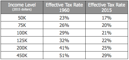
Table-2. Data compiled form the Internal Revenue Service

It’s clearly, unarguably less today. When you take into consideration payroll taxes though, those things that we have to pay to fund social security and medicaid, it actually closes the gap between our 2015 and 1960 tax payments.  But it still doesn’t put us in a situation where the government is taking a bigger chunk out of our paychecks then they used to. Which is why taxation falls into the “same” bucket in our comparison above.  But we are asking them to pay for twice the social safety net programs than we used to and 1.6 billion years of retirement that simply didn’t exist before.  So something has to change.  This is one place where, from a quality of life perspective, things are much better today than they were in the good old days.  But from a sustainability perspective, we’re in a heap of trouble if we stay on our current path.  And trouble that is going to land squarely on my generation when it’s time to retire.

Crime

There’s more crime today as a percentage of our population than there was in the 1950’s.  According to the data from the U.S. Department of Justice,  you are 2.5 times more likely to be the victim of a violent crime today then you were 60 years ago.  The increases in property related crimes was more slight.  But oddly, the murder rate is the same.  Which means we’re assaulting and raping each other a lot more than we used to.  But we’re not killing each other more.   There’s actually an encouraging trend here in the data though.  Our violent crime rate in America hit it’s historic peak in the early 90’s.  Since then we’ve seen a dramatic decrease reducing modern violent crime rates to the levels of the mid 1960’s and trending towards the previous decades.  Despite the amount of high profile gun violence, we’re safer today then we’ve been in about 50 years.  With twice the population living in the same amount of territory.  So we should feel pretty good about it.

The issue that compares least favorably than any other issue besides children born to single parents is our incarceration rate.   We have 3.5 times the percent of our population in prison today than we did in the 1950’s.  And our population has nearly doubled.  To put it in even clearer perspective, we have 4% of the world’s population and 25% of the worlds prison population.  We have more people in prison than China and Russia combined.   And it started when we started putting people in prison for drug offenses.

In 1984, President Reagan signed into law the Sentencing Reform Act as part as the Comprehensive Crime Control act that mandated sentencing minimums and consistency federally.  This was a “tough on crime” bill for which two very clear data patterns followed.  The first was our incarceration rate almost immediately doubled. The second, was an immediate decrease in non-violent crime and an equally steep decrease in violent crime within a decade.  Mind you, one may not have caused the others but it’s important to call out data patterns because it allows us to say at least that the legislation did not make us less safe. And though it may not feel right, it does correlate to a period of decreased crime.   Which tells us that massive populations of incarceration are not a crime or safety problem.  They’re a societal segregation problem.  Because right now, when you go to jail, you clearly aren’t likely to commit a crime against society while you’re in jail.  But you and your family have opted out of most of the American dream going forward. Which is a problem for the last section.  Our social safety net.  I’m not sure the data supports reducing sentencing limits or legalizing drugs from a safety perspective.  But it does tell us we have way too many people in jail, and it’s contributing to the segregation of our country.

Global Stability

We can solve this one pretty quickly.   The first half of the 20th century was the most dangerous time in the history of mankind.  The second half, continuing on into the early 21st century has been the most peaceful.   Though the second half of the 50’s was free from war, we were about a decade removed from WWII and a few years removed from the Korean War.  During those two wars, we lost just under a half a million Americans. The world lost 60 million people.  Including the terrorist attacks of 9/11 and the 14 years of war that about 1% of Americans contributed in, and we’ve lost a little over 10,000 people to combat.  We’re not without conflict.  But no matter how it feels, the world is safer.  And it’s not close.

So What

There’s a lot of metrics that you could track down and a lot more that you could add to try to make a point one way or another.  But the bottom line is this.   Things were different in the “golden age” of American than they are today.  In some ways they were better.  But in more ways they were either worse or simply different.  Right now there is a large part of the American public, our media and our overall consciousness that believes that we’ve wandered off of a path to greatness and that we are far worse off today then we were then.   And that we need to return to “better times.”  I would issue a word of caution for those that hold that sentiment.   Both the data and the historical context are clear.  For a very narrow portion of our society, healthy white men, things were better.  If by better you meant you had no competition for work in an economy that was booming because of the impossible to duplicate post WWII reconstruction.   For everyone else, things weren’t better.  They were far, far worse.  I’ll play this out in a real world experience, mine.

I’m a pushing 40 white man with a graduate degree.  By all rights, I should look back at the 1950’s as a time that would have suited me fine.   But a closer look tells you different.  My wife, half Latina, would have faced some level of segregation in primary and secondary school for her ethnicity. Even if she made it past it and completed the two graduate degrees she has today, she would have no place helping homeless veterans as she does now, other than administrative support in the mental health profession. My mother’s four year battle with ALS that rendered her incapacitated for the last three, would have bankrupted my entire family.  My non-verbal, autistic child would be locked away in an asylum, the doctor’s would be recommending a lobotomy as his best path for treatment.   When I returned from war and struggled with anxiety and depression, I would have turned to the bottle and soldiered on in silence.  This is would have been my reality.  And I’m a healthy white man.  Which means I’m in the best shape out of any one.  If I were black, I would be in poverty and not allowed to eat or attend school with white people in most states.  If I were gay, I would be a pervert.  If I were handicapped, I had no path to independence or contribution in society.  This was the reality.   It was cruel and unforgiving.  And it makes for a bad bumper sticker.

As for the next generation, they’re fine.  They’re more educated and more technical than ever before.  And we’re right.  They wouldn’t last a minute on the assembly line in a plant.  Which is good.  Because we don’t have many of those these days.  Which is fine.  Because we’ve adapted to our role at the top of the global economic food chain as a services and consumption economy.  That’s how it works.  But they wouldn’t last a minute 60 years ago.   Just like their parents wouldn’t have lasted a minute in the coal mines and blast furnace of the generation before.  Just like that generation never would have lasted a minute scratching out a living off the land in an agricultural society.  Just like that generation of farmers wouldn’t have lasted a minute blazing a trail from sea to shining sea.   Just like that generation never would have had the guile to throw off an unjust government.

That’s how this thing works.   One generation judges the next on their ability to exist in the past.  And that generation learns the skills it needs to survive for the next fifty years.  And doesn’t learn the ones it took to survive in the last. But they’re fine. The kids I served with in war and now show up at my door in the big time technology industry can do things I can’t.  What I know, would not have gotten me hired at 22 today.  But instead of being scared of that, I learn what I can from them and help bridge the gap between what I know and have experienced and what they do so that we might walk across it to a collectively brighter future.  It’s called mentoring.  And when you do it, they listen. And when you whine about “kids these days” they don’t.  So give it a rest.  You sound old and scared.

So what does it all mean?  Well, as far as the political discourse it means this.  If you’re a progressive elected official, you can stand back and admire the social progress that you’ve help engineer over these last 60 years that has made life, liberty and the pursuit of happiness more attainable for more groups of people.  But there’s one thing that you can’t say and it’s that the social safety net that we have in place is moving people out of poverty and into financial stability.  It’s not working.   And you need to own that and help drive solutions in an economy where urban middle class jobs do not exist any more.

If you’re a conservative, you can congratulate yourself that we’ve managed to shoulder the massive load of providing government and services for 320 million people without taxing our constituents to death or crippling capitalism.  But what you haven’t done is find a way to do that without deficit spending.  And when you’re realistic about our aging, longer living population, you need to own doing something about our current revenue gap, or when my generation retires, the draw we will have on the broader economy will cripple us.  It’s simple math. And please stop with the “let’s go back to Mayberry” rhetoric.  Because it’s not real.  And for most of us we just hear thinly veiled bigotry and close minded thinking.  It’s not helpful.

For those of us who still suffer from the burden of free will with our votes, let’s keep an ear out for anything that starts to resemble that kind of discussion.  Until then, just keep tuning out the fear-mongering or blind compassion.  It’s not worth the mind space. We’ve got real things to solve.  And getting back to the “good old days” doesn’t solve any of it.
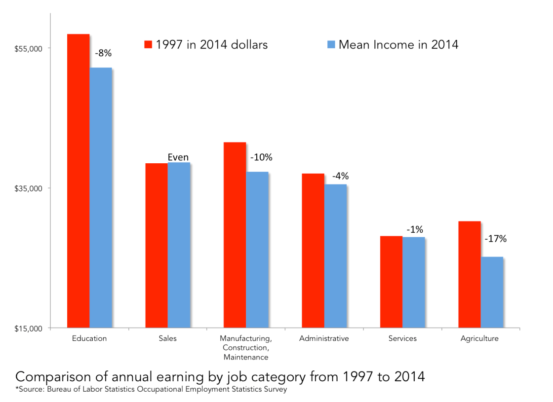
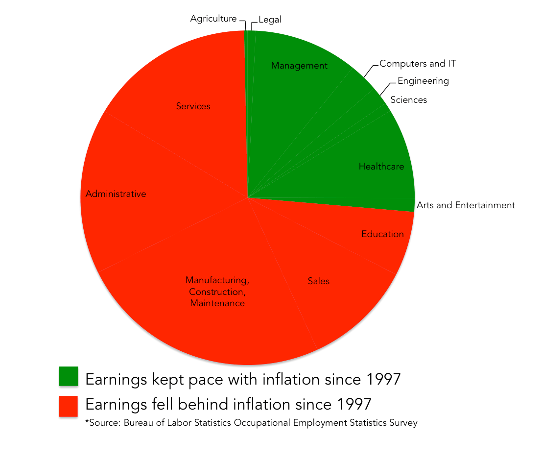


Guns, People and Poverty: A Study in What Kills Who


Guns don’t kill people. People kill people.   It’s a logical statement and one that’s hard to argue against. It usually pops up in some form on your social media stream in the aftermath of a mass shooting. Clearly it’s unfortunate that mass shootings happen with enough regularity to be able to present a pattern. The patterned response exists nonetheless.  Since it does, we probably owe it to ourselves to do a little digging on its validity. So we did. We compiled data from three sources: the CIA Fact Book, The United Nations Office on Drugs and Crime, and the World Bank Group. In doing so we were able to establish a complete data set on 71 countries from all regions of the globe that could provide current data on socioeconomic status, homicide, gun violence and urban/rural population density. What the data shows was very telling. Here’s what we found:

If you are going to murder someone, you’re probably going to do it with a gun

Of all the homicides in the 71 countries that contributed to the analysis, two-thirds of them were committed with a firearm. By itself this data point alone says nothing specifically about whether or not guns actually contribute to the chance that someone is going to get murdered. It only shows that the method of choice in homicides is a gun. It leaves plenty of room for the argument that once a person decides to kill someone, they’re going to do it by any means available. The gun is simply the most available. It’s not an impossible argument, though its hard to imagine how people would figure out how to pick up the slack in the absence of such an efficient tool as the gun.

An interesting pattern appears when you include the overall homicide rate along with the percentage of homicides committed by firearm though. What we saw was that as homicide rates rise, so does the percentage of homicides committed by gun. Take Honduras for example, the murder capital of the world at almost twice the murder rate of the next most murderous country Venezuela. The percent of homicides by firearm in Honduras is 83%.   Venezuela’s is 80%. On the other end of the spectrum we have Denmark. Denmark has the lowest homicide rate of any country in the analysis. Less than a third of their homicides were committed by firearm. What the data tells us is pretty clear. If you want to contend for the title of murder capital of the world, you can’t do it without using guns. After all, if you’re in the volume business, efficiency is key. When it comes to killing, guns are as efficient as it gets.

Guns alone actually don’t kill people.

Does the presence of guns alone lead to gun violence? Chalk one up for the gun advocate lobby here. The amount of civilian owned firearms in any given country alone actually has no correlation to the homicide rate. According to the annual UN survey, there’s a lot more guns out there then you would think. Our love affair with the firearm in America is well publicized. With 88 guns for every 100 people, our reputation is warranted. We’re more than twice the next highest country. Not far behind us in the rankings is a country like France. France has about 31 firearms for every 100 people. Both the U.S. and France are nowhere near the top of the homicide list, despite being at the top of the list of the countries with most civilian owned firearms though. To answer the narrowly focused question, do guns kill people? The data is clear. Guns alone do not kill people. There’s a trend hiding in the data though. You just need to add one more ingredient to see it.

Something very interesting happens when you include poverty in the analysis. What we see is that though having a lot of guns does not make for a dangerous society, adding poor people and guns together does. Take a country like Liberia in West Africa. Liberia is the poorest country in the analysis with 80% of its population living below the poverty line. With that level of poverty, it’s pretty easy to assume that they also have a high homicide rate. That would be a poor assumption.   You’re actually more likely to get murdered walking the streets in America than in Liberia. In fact you’re almost 50% more likely. Why? Again, the data is pretty clear. Liberia has no guns. Liberia has one gun for every 100 Liberians. We have 88.

Liberia isn’t an outlier either. Chad, Niger, Senegal, India, Bangladesh and Cambodia are all countries with huge poverty rates from different regions of the globe that all have the types of low homicide rates that rival first world countries. They also all rank in the lower third of all countries in civilian owned guns. When you add guns to poverty you have places like Honduras, Colombia, Mexico and South Africa. These titans of murder find themselves in the top third in poverty and civilian firearm ownership. The data is clear and unambiguous. The secret sauce that leads to the highest murder rates in the world is one part poverty, one part fire arms. Guns don’t kill people. Poor people with guns kill poor people.

So what about America?

Using the Liberia example again we can actually do a pretty useful comparison. If you live in Liberia, you are five times more likely to live below the poverty line than in America. If you live in America you are 88 times more likely to own a firearm than if you live in Liberia.  If you live in America, you are 50% more likely to be murdered than if you live in Liberia.   There’s really only one theory to take away from that comparison. Either we Americans are just inherently more violent than Liberians, or it has something to do with the guns. When you add other countries into that same comparison and we see the same thing over and over again, we start to approach a pretty sound conclusion. Our propensity to own firearms appears to make us less safe than other first world countries and even some third world ones. But if guns alone don’t make us unsafe, which is what we clearly stated previously, then why are we less safe then other countries?

For one, we have so many more guns than everyone else, it’s almost impossible to think that there would be no consequences to that. Even if you were willing to make that leap though, there’s another interesting dynamic with America that you have to consider. Though we are undoubtedly one of the world’s most prosperous countries, we have a much higher poverty rate than our more socialist or communist counterparts. This is no commentary on the evils of capitalism. I’m a big fan. So let’s quickly get past that. What is important though is the fact that we do have concentrated pockets poverty that also have high civilian gun ownership. The result of this is that though our national homicide rate is low relative to the whole group, the consequences of the pattern of poverty and guns on our urban areas has an acutely destructive impact on them. Let’s use Chicago as an example. Chicago is the murder capital of the United States. Pockets of Chicago’s South and West Side have between 40-60% of their residents living below the poverty level. Now add the high civilian gun ownership rate that is experienced across America, you get a very rough outcome.

Numerically speaking, the Chicago Metropolitan area has a homicide rate that would put it in the top ten countries on the planet wedged between Nigeria and Panama. Chicago is not alone. Baltimore is actually worse percentage wise.  It’s on par with Rwanda. Yes, Rwanda, the place with the movies about genocide.  Even less prolific metropolitan areas like Philadelphia, from a homicide perspective, are on par with places like Angola or the Sudan. When you put it in perspective, it starts to feel like something that requires more than a bumper sticker for a solution.

So What?
The striking conclusion that we can take away from this broad analysis is that guns are just another one of many aspects of the human experience that make it much harder to be poor. Like drugs, disease, and recessions, adding guns into poor environments has a disproportionately negative effect when compared to more affluent areas.  In America, the gun control discussion is one of the most divisive and partisan ones that we encounter.  The debate involves special interest groups, culture, tradition and a standing Constitutional debate about what our founding father’s intended. What it rarely involves is fact, data and perspective.  When the loudest voice in a debate leads with rhetoric you get bumper stickers and memes instead of informed insights and decisions.

The data is clear. Without question, guns kill people. Not by themselves of course. No one ever claimed that a gun by itself killed anyone. We should find that particular challenge to gun control insufficient if not insulting.  When the conviction in a debate is on the side least impacted by the negative outcomes of an issue, it should signal a call for those objective few among us to look harder into reality to demand more of the discussion. The analysis is done. The conclusion is a hard one. Guns kill poor people. Whether or not you care about that is up to you.

The Great American Economy: A Study in Data and Self Deception

Economy  noun econ·o·my \i-ˈkä-nə-mē, ə-, ē-\ the production, distribution or trade, and consumption of limited goods and services by different agents in a given geographical location.

When we ask the American people what their top considerations are in any congressional or presidential election, without question one of the top issues they raise is the economy.  From the definition above, it’s hard to actually imagine that people care about the economy in a literal sense though.  The theories and systems related to that which is described by the definition of an economy are best left to classrooms.   What people actually mean when they say “the economy” is that they care about aspects of our fiscal and monetary policy that actually impact our lives.  Fiscal being budgetary and taxation activities.  Monetary being activities conducted by the Federal Reserve that impact interest rates.  We choose to use the word “economy” to sum all that up in one average sized word.  We like terms that we can put in our back pocket so we can pull them out when required in discussion or debate to prove a point.   So the “economy” is what we care about.  And so it becomes top issue.

If you think about it just a little bit more though, you can actually give some purposeful voice to the demands of the people’s economy.  When you think about it in reasonable terms, and its important to be reasonable here because there’s quite a bit at stake, you can produce a pretty distinct list of exactly what we care about. To be even more precise, you can get to eight portions of the economy that we really care about.  Here they are in a somewhat particular order.

What American people want of their “economy”:

1. Income that keeps pace with inflation

2. Job growth equal to employment demand

3. Stable employment rates

4. Historically moderate tax rates

5. Affordable cost of borrowing

6. Participation in growth through investment

7. The ability to retire at a reasonable age

8. A safety net in hard times.

The good news is, we actually have data on all eight of these categories. When you throw economic theory and political principles out the window, you can do some unbiased statistical analysis.  So we did that.  We analyzed 19 separate economic categories that included government spending, income tax rates, interest rates, trade deficits, financial markets, GDP, budget surplus/defecit and corporate profits.  By simple correlation analysis, we can ignore the rhetoric and theory and look at simply what the data tells us.   So here it is both in raw form and commentary.

Screen Shot 2015-05-20 at 10.47.29 PM

What happens when taxes went up? 

People had less money.  But you didn’t need data to tell you that.  But interestingly, job growth increased and unemployment decreased.  The S&P 500 went up.  Corporate profits decreased, which makes sense, because they were paying higher taxes.  In the statistical world, we are always careful to point out that correlation is not causation.  Which means in lay terms, just because two points of data showed a pattern, it doesn’t mean one caused the other.  What we do know is that the data alone does not support the history of dire economic consequences from tax increases.  That doesn’t mean we have to like them though.

What happens when corporate profits increase? 

Surprisingly nothing.  Though profits increased with lower taxation, the growth doesn’t appear to materialize into wage increases, job growth or significant financial market gains.  From a data perspective, the only thing that appears to benefit from corporate profits, is well, corporate profits.  This isn’t a purposeful commentary about the evils of corporate America. It’s simply what the data says.

Screen Shot 2015-06-08 at 11.28.25 AM

What happens when corporate profits decrease?

We don’t know because it’s never happened.   Even during the great recession that started in 2008, corporate profits continued to grow at record rates.  What correlates to the spike in unemployment and the crash in financial markets is a slow down in the rate of growth.  Which means companies were more profitable during that time than in the years previous to the crash, they just weren’t more profitable enough.  And why did it slow down?  As far as the data shows, for no reason at all related to taxes, wages, spending, interest rates etc.  Which leads us to believe that free market forces of expansion and contraction dictate rate of growth; not taxation, wages, spending, trade, currency exchange rate etc.  Again, this is not principle or rhetoric, just data.

Do we spend more tax payers money when we raise taxes?

Oddly, no.  One of the strongest correlations in the entire analysis shows that we spend more when taxes are lower.  Clearly no one is arguing that when we lower taxes, we spend more because taxes are lower.  What we are saying however, is that the data shows us that we spend independent of how much money we collect from taxes.  Which is why our national debt is higher now as a percentage of GDP than at any time in our history.  The conclusion is that it has at least as much to do with historically low tax rates than it is out of control spending.

Is our spending out of control?

We do spend more than we used to.  The increases in spending exist in social security, medicare and medicaid, and social safety net programs.  People live longer then ever before and medical care that simply didn’t exist in the recent past presently does exist.  What we choose to spend on safety net programs is a choice. When unemployment spikes, our government spending does as a result.  Choosing to do so however appears to have no negative impact on any economic outcomes that we care about, other than supplying us with income and resources when we fall on hard times.  It simply means we spend more money.  Which matters, especially when you don’t fund it.

So what’s the “so what”?

What does it all mean?  The rhetoric around taxes and spending and how it impacts our lives is not supported by the data.  We certainly don’t like to pay higher taxes.  Nor should we.  But the increased costs associated with modern lifespans and healthcare are taking their toll.  And this is not because of the Affordable Care Act.  At least not yet. Most of this data comes from well before it was in place..  There is one important consideration though.  Whatever our political affiliation, we all agree that at a minimum, a government’s role is to exist and remain solvent so it can continue to govern. Which is a pretty low bar.  If you take this data seriously, and I do, you see that there’s nothing that actually supports the “trickle down” effect from lower taxes.  Which is actually good in one way.  It leaves us with a clear choice; to have the services that our government presently provides or to not have the services that our government presently provides.  Right now we’re choosing to have them and not pay for them because we’re hiding behind the rhetoric that choosing to pay for them would be bad for the economy.   The data doesn’t support it but our inability to have effective political debates in congress, or anywhere won’t let us get to that choice.  My guess, is we’d have some, divest of others and maybe even improve ones that weren’t working.  We’d be forced to prioritize.  That is, if we could actually talk about this.  Which we can’t.

This level of analysis isn’t particularly hard to do and the conclusions that it yields are strikingly conclusive.  They’re just not popular ones to advocate for because frankly, we can’t have honest discussions any more without being stuck in the irrelevant loop of “government bad” -v- “government good” paralysis.   Which puts us in the impossibly dysfunctional position of having more, paying less and not being able to prioritize anything until we drive off a cliff of insolvency.  Painful truths hurt.  So we don’t say them.  If we don’t want to pay for the social programs, then cut them.  But there will be no denying that we are cutting them in order to preserve the lowest tax rate in my life time. Or, maybe we try reviewing and prioritizing, like any organization on the planet that has a budget. But we can’t, because we’ve stopped talking.   And so the self deception continues and our deficit grows as does our compliance with our insolvency as a nation.  This one actually isn’t that hard. But it’s going to take a discussion.  And we can’t do that any more.

The American Presidents….By the Numbers

In 1948, historian Arthur M. Schlesinger conducted a poll of 75 historians asking them to answer the question, who are our greatest American presidents?  Since then, and probably before, it’s been a pretty popular debate.

Though previous attempts to rank our presidents have been based on observation and opinion, the names at the top and the bottom of the lists are pretty consistent; Lincoln, Washington, FDR at the top. Andrew Johnson, U.S. Grant, Warren G. Harding are at the bottom. When you actually think about it though, it’s really an impossible question. Is Washington better than Lincoln? Probably not at winning the Civil War at least.  He owned slaves and had a penchant for leading uprisings against his government. Washington probably isn’t your guy in 1861. We’ll never know what speech Millard Filmore would have given the day after the Japanese attacked Pearl Harbor. Most of us will never know anything Millard Filmore said. I promise you though, he was our 13th president.

Circumstance plays a big part of it and so it becomes an illogical discussion.  So why do we do it?  Partially because debate is an inescapable function of the human condition. It’s what we do. We argue about just about anything we can compare. There is another reason though. A more practical one. We debate who our great American presidents are because we are bench-marking our current prospects. We are looking at the greats of the past to see the potential in our future and so we find value in the debate. Because we find value in the debate doesn’t mean that we are having the right debate though.

A more effective question is what makes a great president? And if we were to look at how we’ve evaluated them in the past the answer is clear. For the most part, it’s crisis.  The true great ones, Lincoln, FDR, Washington, led through periods of dire crisis.  Which begs the next question.  Do we really want the next great president? It probably sounds counter-intuitive but I hope I never live to see our next great American president.  I hope that great American presidents are over.  Great American presidents mean war, suffering, economic catastrophe and death.   So when we talk about great president’s, might we have the debate differently? Shouldn’t we shy away from desiring a great president and instead focusing on desiring a great presidency?  That’s what I’m rooting for.

With that in mind, we took a shot at looking back at our presidents through that lens.  We built an algorithm to see what the data says and then compared it to what history says.  The results were interesting.

The good news is that this is actually pretty easy.  Because you can  measure prosperity, progress and opportunity, things we would likely agree make for a “great presidency” by observing patterns in economic data, scope and scale of war, territorial expansion and Constitutional legislation.   So that’s what we did. The table below illustrates the rankings of American presidents by using an algorithm incorporating historically collected data.  The table compares the outcomes of the algorithm to the aggregated results of a dozen or so polls of historians regarding presidential rankings.   As you might expect, the data tells a different tale then the anecdote.

Score Algorithm Ranking Historical Ranking
100 George Washington 1 3
74 Ulysses S. Grant 2 37
73 Thomas Jefferson 3 4
69 Andrew Jackson 4 8
67 James Monroe 5 14
65 Bill Clinton 6 21
63 Ronald Reagan 7 17
63 James Madison 8 13
62 Franklin D. Roosevelt 9 2
61 Grover Cleveland 10 19
60 Rutheford B. Hayes 11 25
58 Dwight D. Eisenhower 12 9
57 Theodore Roosevelt 13 5
57 John Adams 14 18
57 William McKinley 15 20
52 Harry Truman 16 7
52 Andrew Johnson 17 41
52 James K. Polk 18 10
51 John Tyler 19 36
51 Barrack Obama 20 16
50 Lyndon B. Johnson 21 15
50 Woodrow Wilson 22 6
49 John Quincy Adams 23 18
48 Millard Fillmore 24 39
47 James E. Carter 25 27
47 George W. Bush 26 33
47 Calvin Coolidge 27 31
46 William Taft 28 22
45 George H.W. Bush 29 23
43 Franklin Pierce 30 40
42 Martin Van Buren 31 24
40 Chester A. Arthur 32 28
40 Richard M. Nixon 33 32
39 James Buchanan 34 42
37 Warren G. Harding 35 43
37 Benjamin Harrison 36 38
36 Gerald R. Ford 37 26
35 John F. Kennedy 38 11
22 Herbert Hoover 39 30
22 Abraham Lincoln 40 1
19 Zachary Taylor 41 35
17 William H. Harrison 42 38
14 James. A. Garfield 43 29

The data behind the comparison shows several things.  First, the algorithm and the historian polling are moderately correlated, meaning that the two lists are not entirely at odds with each other.  Immediately, some clear differences jump out at us though.  Here are some of the more glaring insights.

Where’s Lincoln? 

I challenge you to find a historian that does not include Lincoln in their top three on their index of presidential greatness. This algorithm, however, does not measure personal greatness.  It measures outcomes relative to the quality of life of the people being governed. Lincoln’s presidency was marked by unprecedented carnage through war, national crisis and ultimately assassination. It’s safe to say if we could have avoided it, we would have.  The numbers clearly show that, giving him the most significant historical overvaluation relative to the data.

There’s something else interesting though. You can’t really capture, through data, the accomplishment of paying off the debt of overdue societal progress. Which tells us that ignoring required change, like abolishing slavery, ultimately results in really lousy outcomes for the people who actually put their foot down to change it.  And though history treats them well, the lives of the American people, as they lived them, were miserable.  So if you can, change things before you have to.

Was Washington really that great?

Was Washington really worthy of the title father of our country?  The data says so.  He had the highest average economic growth of any two term president outside of FDR.  Despite our fledgling status as a nation and our relative inability to defend ourselves against foreign enemies, Washington managed to steer us clear of war.   He signed just under half of all Constitutional Amendments ever passed and he expanded the territorial holdings of our country from nothing to something.  The first eight years of our country’s existence could have gone terribly wrong but it did quite the opposite.  Washington oversaw prosperity, stability, growth and progress on a scale not duplicated by any president since.

Did we really get Grant that wrong?

Grant was a great general, but a bad president.  That is what I was taught in history class growing up and obviously what our historians voted as they ranked him the 37th ranked president out of 43.  The data shows something different.

Though recession hit during the latter years of his two terms, the recovery and post-Civil War boom actually show that America experienced 5% GDP growth annually during Grant’s two terms. This ranks him fourth among all two term presidents behind FDR, Washington, and Jackson for economic growth.  As a modern frame of reference, Reagan and Clinton, both uniformly considered to be fiscal successes as presidents, were both about 4.1%.

President Grant also governed during a period of relatively stable peace and even ratified the 15th Amendment providing the right to vote to African Americans, a significant political debate of the time. So why is history down on Grant? The headlines point towards corruption and the eventual recession of the mid 1870s. Data doesn’t measure corruptions.  Just outcomes, but it does raise an interesting question.  Should we care about corruption if it doesn’t hurt us?  I think we do but perhaps the lens is that it is more of a long term problem.  We shouldn’t tolerate corruption, even in an environment of prosperity because it erodes the fabric of our political discourse. And ultimately it breaks down.  Site Bill Clinton and the damage his character issues did to the perception of trust in our politicians.  More on him later though.

There’s something else interesting in the data relative to Grant. If you look a little deeper, we begin to see indications of what may have been influencing our historians in their selections. Of the presidents that have the largest historic undervaluation relative to the algorithm, the top two, Grant and Andrew Johnson immediately followed Lincoln.  Rutherford B. Hayes, who followed Grant, also cracked the top 6 of undervalued presidents. This group who ushered in the era of those labeled the “forgetful presidents” has been much maligned by history.  But they actually governed during a period of unprecedented growth and stability.  But we know growth and stability isn’t what we remember. We remember the other stuff.  It’s safe to say that Grant, along with Andrew Johnson and Hayes suffered mainly from a case of not being Abraham Lincoln.  History has never really gotten over the fact that America was robbed of being led through post-Civil War reconstruction by the hero that delivered us from near destruction as a nation.

What gets a president noticed?

James Garfield spent 200 days in office.  Despite that, historians have him ranked as the 29th greatest president.  That means, despite being in office for about as long as a single Major League Baseball season, Garfield is considered a more effective president than 14 other men by historical opinion.  Only two of those 14 also served for under a year. Which means Garfield, having done nothing at all, in a literal sense, is considered more effective than 12 other presidents who served in office for years. This includes two term Presidents Grant and George W. Bush.

How is that possible?  The pattern in the data is very clear.  Of the four most overvalued historic presidents, three were assassinated.  Lincoln, Kennedy and Garfield were all killed while in office.The fourth most overvalued president, Woodrow Wilson, was a war time president.   If you want the American people to remember you fondly, get killed in office or go to war. Both things, most would agree would be outcomes to avoid, if we could.


What about the new guys?

The algorithm doesn’t care about how recently you were president. Reagan and Clinton are both ranked in the top ten, having served two peaceful terms of economic prosperity within the last 40 years. Both also crack the top eight undervalued presidencies. Historians tend to need some water under the bridge before they feel justified in giving due credit. After all, they are historians.  The data says that President Obama is ranked 20, just four rungs below where our historians forecast his placement.  The data behind his predecessor, George W. Bush, hands him the title for the lowest ranking full two term president at 26. I have some particularly leftward leaning friends who wonder regularly how “W” got two terms. The data supports their concerns. To keep this discussion data driven and bi-partisan, the outcome of the “Hope and Change” promised by Candidate Obama has him looking up at President John Tyler. From a data perspective, Tyler had a more effective presidency despite his somewhat less inspiring campaign slogan of “Tipecanoe and Tyler too…”

So what?

In the end, the data is just another way to debate the question.  It’s an algorithm that was built by a person, which means it is subject to its own biases and inadequacies. What it does show is that there are patterns to our bias that data and analysis can point out. It also shows that data, while important, often misses the qualitative aspects of measurement, like the gross injustice of slavery that mandated Lincoln’s great national and personal sacrifice.  Or the scandal and clear instances of dishonesty of the Clinton era and the long term erosion of the confidence in government.  But the data does serve to offer a different perspective. It’s why we use data in business.  It’s why we use it in sports.  And now, more than ever before, data is how we make sense of our past and the world around us.

For me it brings our two critical insights.  And the first is that presidential performance is outlived by societal impact.  You can change, for good or bad, things that long outlive your term.  The second is that change is easiest before its needed.  And though we celebrate the presidents who force it under dire circumstance, the lives of Americans who lived through it are largely miserable.  So change things before you absolutely must.  Think social security, climate change etc.  If you don’t and you rely on the “great man” to do it for you, the fee is high for that service.

In the end, it’s data.  And data helps start the discussion.  If it ends there, it’s less useful.  But if you ignore it, you tend to start in the wrong spaces.